
Crafting Joy with March’s Lollipop Box Club Kit
Hello everyone!
Sorry my post is a little late this month, time just flies when you’re working what feels like 24/7!
There’s something so grounding about sitting down with a fresh Lollipop Box Club kit, opening the lid, and feeling that spark of inspiration hit before you’ve even touched a pair of scissors. March’s box was exactly that for me — soft colours, whimsical florals and those uplifting phrases that feel like a gentle nudge to slow down and savour life.
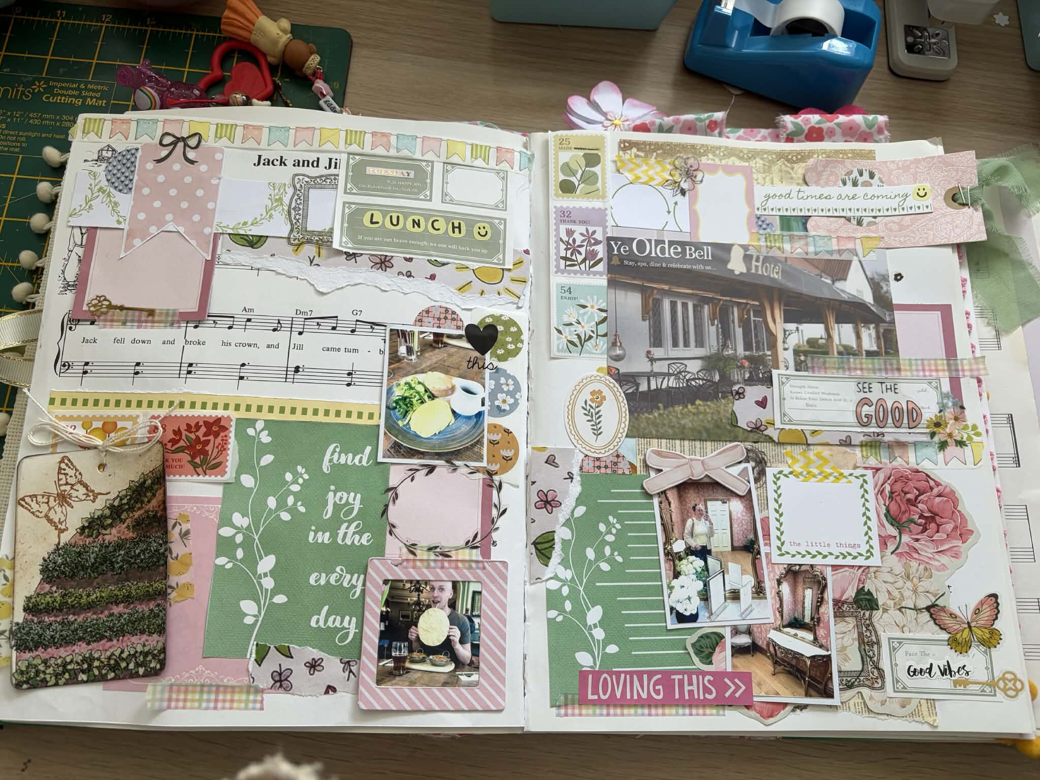
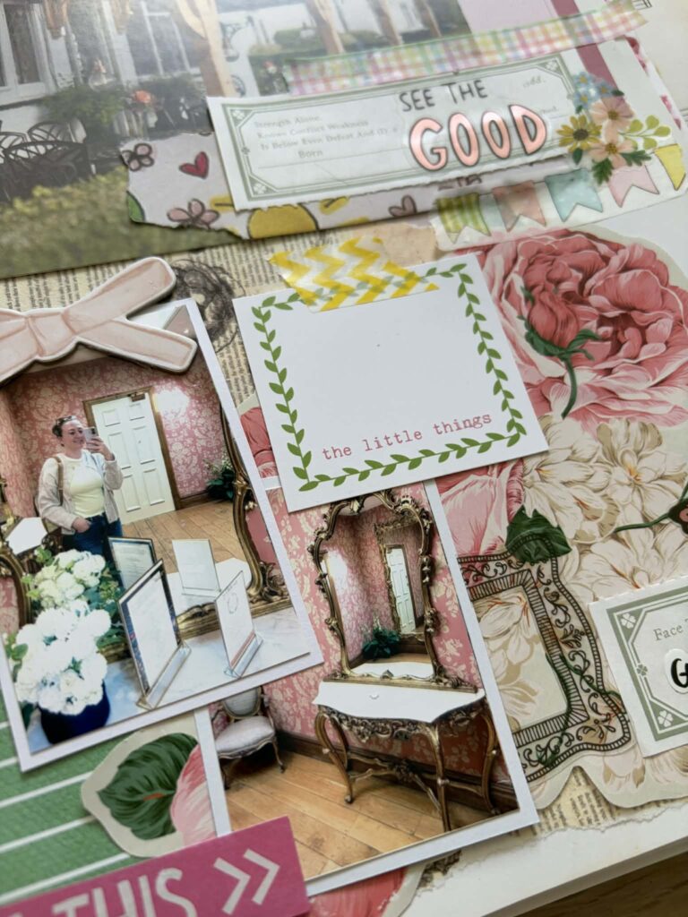
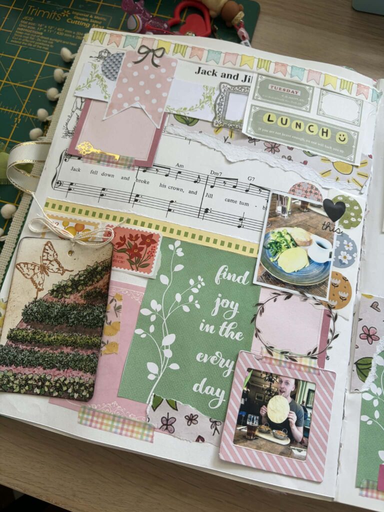
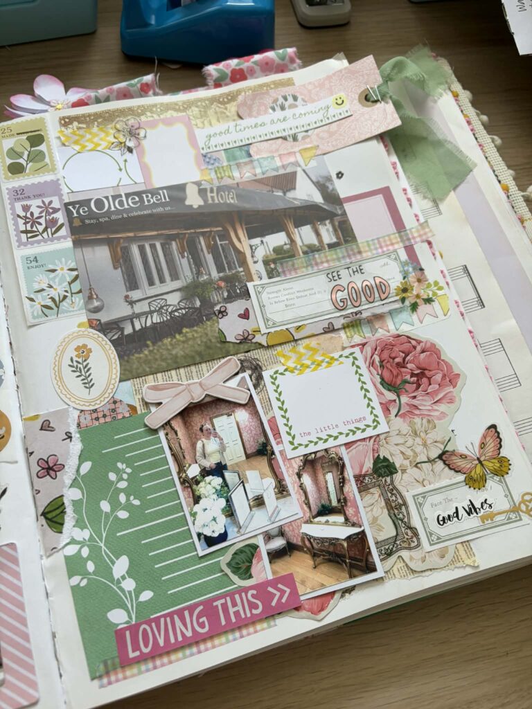
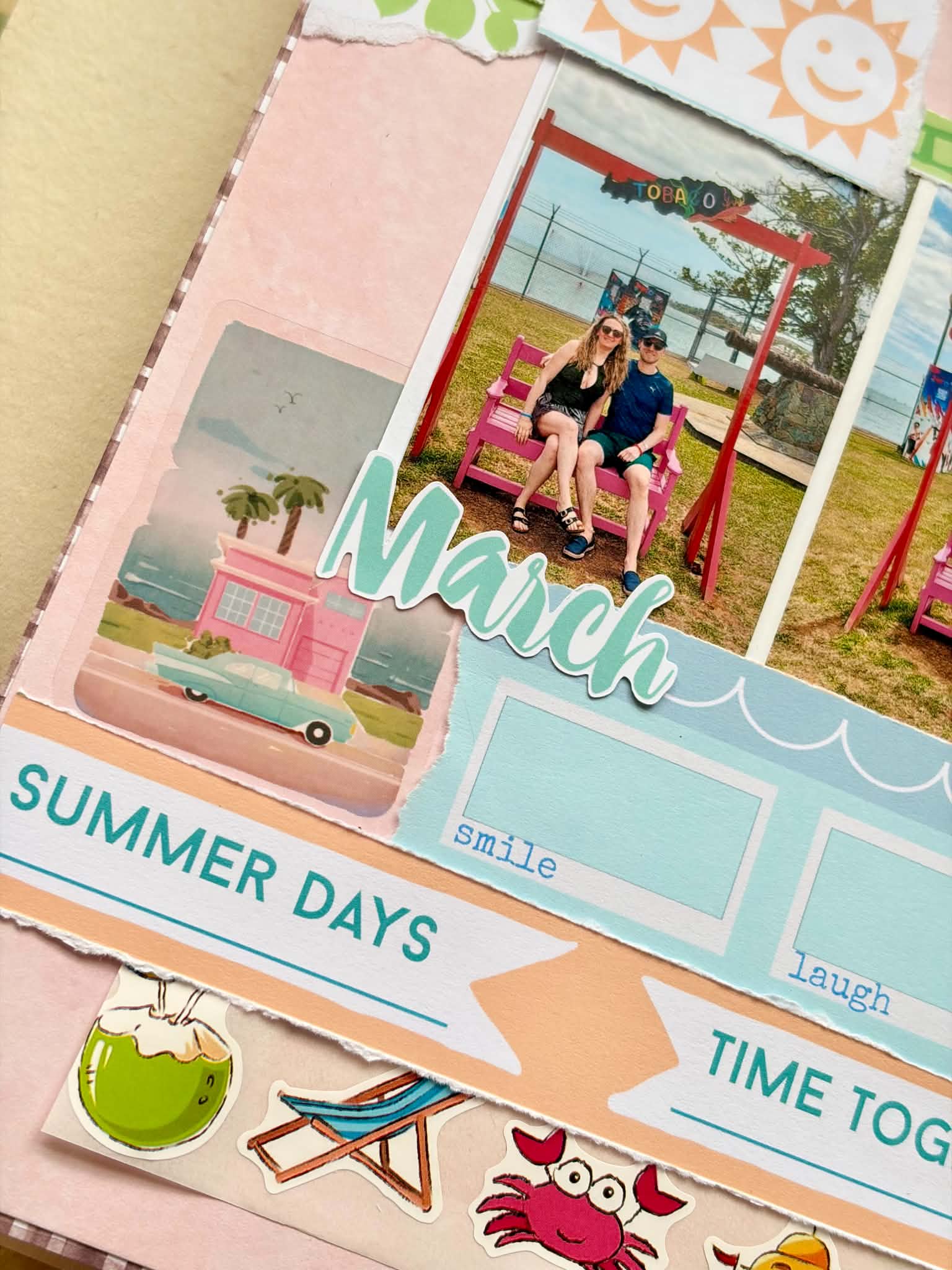
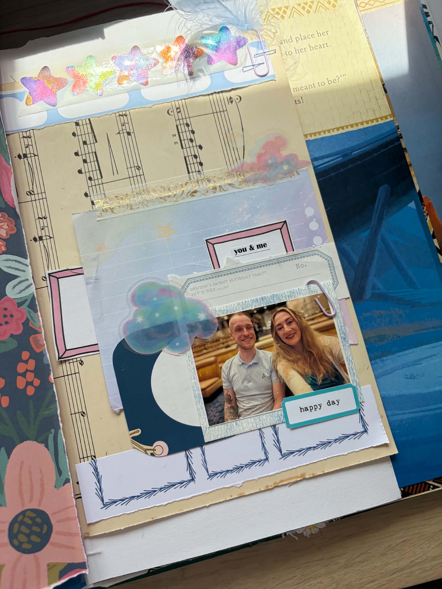
This scrapbook spread came together after a lovely visit to Ye Olde Bell Hotel, a place that feels a little bit like stepping into a storybook. We also visited to scope it out for our wedding venue(!)
I wanted the page to capture not just the photos, but the feeling of the day — the excitement, the comfort, the simple pleasure of a good meal and good company.
The kit’s pastel palette worked perfectly with the hotel’s warm tones and the lunch photos. The colours in the box felt made for this memory — soft, happy, and gentle, echoing the mood of the day so well.
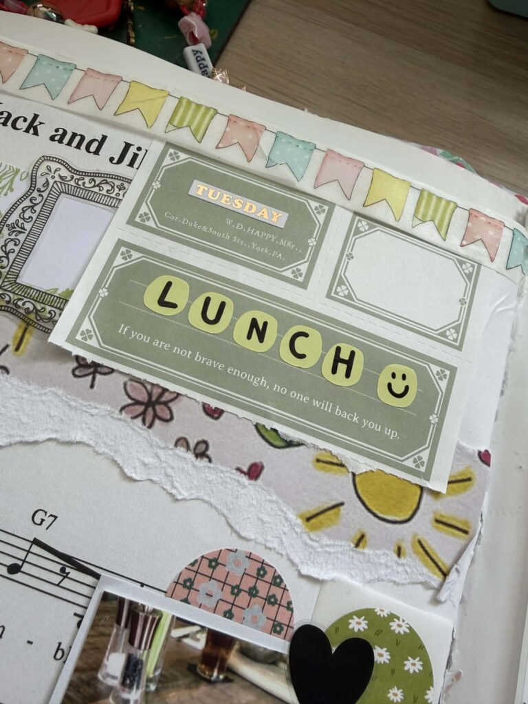
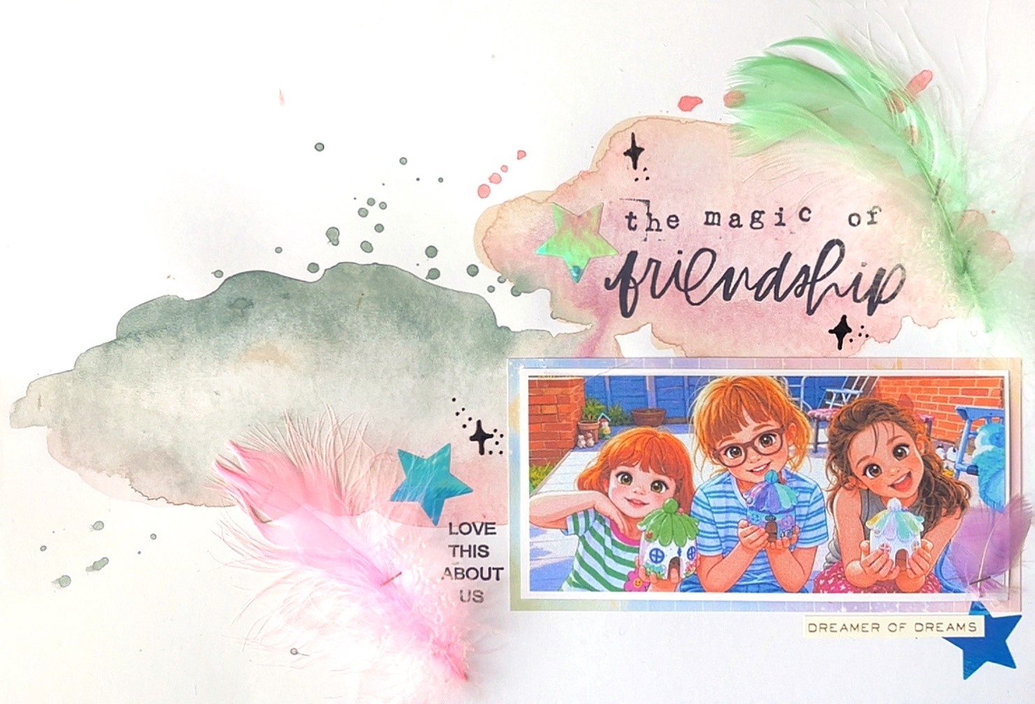
One of my favourite touches from the March box was the little floral stamp stickers.
How I Built the Layout Step by Step
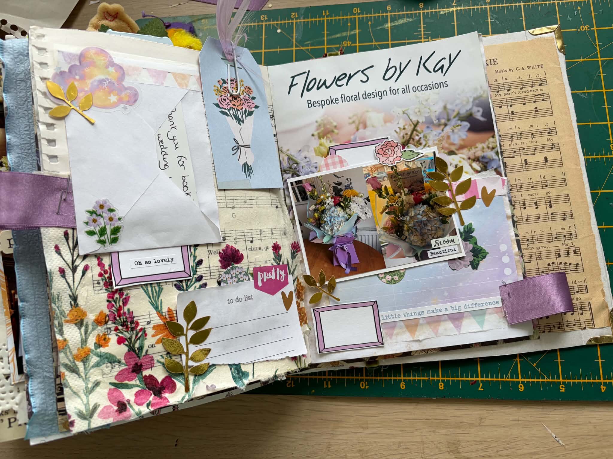
1. Starting with my journal pages I began by opening up my journal and deciding which pages would best frame the story of the day. I always like having a double spread so the photos, journaling, and decorative elements could breathe a little and don’t feel cramped.
2. Choosing the photos and placement Next, I selected the key photos, including the hotel’s postcard advertisement which I picked up as soon as we walked in! I played around with where they would sit on the page, making sure each image had enough space and that the eye could move naturally across the spread.
3. Layering the cut‑apart zine pieces Then I reached for the cut‑apart zine from the box. I trimmed out my favourite phrases and decorative pieces, using them as the first layer behind and around the photos. These pieces added structure and gave me little “pockets” of interest, almost like mini frames and tabs that guided the story.
4. Adding the treat bag elements After that, I dipped into the treat bag elements. These are always such fun little treasures. I tucked them behind photos, peeking out at the edges, and layered them over the zine pieces to build depth. This is where the page really started to feel dimensional — like the memories were stacked and stitched together.
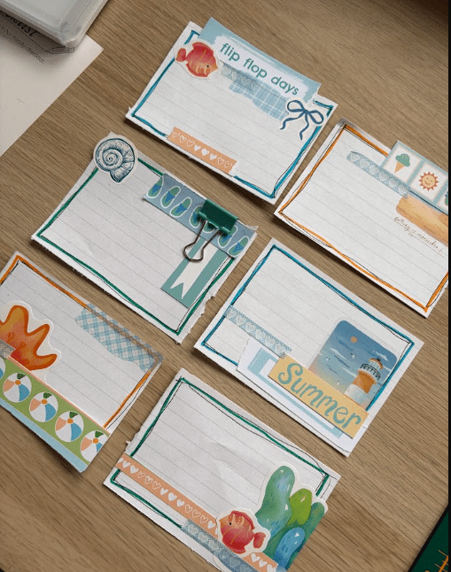
5. Building interest with stickers Once the main layers were in place, I brought in the stickers from the box, as well as some pieces I picked out from my own stash.
6. Leaning into the pastel colour palette Throughout the process, I kept coming back to the pastel colours. They suited my photos so perfectly — the soft tones of the hotel, the gentle light, and the relaxed feel of lunch. I made sure every layer echoed those shades, so nothing felt too harsh or out of place. The result is a layout that feels calm, cohesive, and very much in tune with the day itself.
7. Finishing with small details and journaling To finish, I added a few final details and any little bits of journaling I wanted to remember — the place, the moment, and how it felt. Nothing too heavy, just enough to anchor the memory in words. Once those were in, I knew the page was done. It felt full, but not crowded; detailed, but still soft.
I absolutely LOVED this month’s kit, the pastels for spring are just *chef’s kiss*!
I would LOVE to see what you create with your kit, and what is your favourite element of this month?
Leave A Comment